The Logo That Shocked the Rugby World
London, England
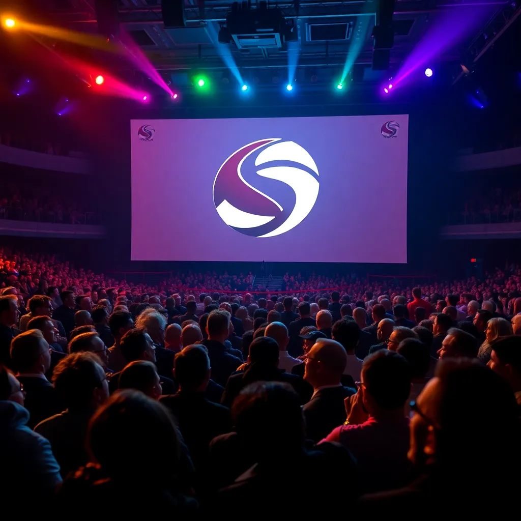
In a move that has left fans scratching their heads and social media buzzing with memes, the Six Nations Rugby Tournament unveiled its new logo aimed at encapsulating the “electrifying action” of the competition. However, the response has been anything but electrifying, as the logo has been ridiculed across various platforms, from Twitter to TikTok.
What was intended to be a symbol of strength and excitement has turned into a running joke, with fans referring to it as looking like a “broken rubber band” or a “squashed banana.” The branding team, clearly aiming for a vibrant and modern look, may have inadvertently created a visual representation of confusion and disappointment.
The Logo Launch: A Moment of Prestige or Pity?
The launch event, which was supposed to be a celebration of rugby, quickly morphed into a showcase of how not to design a logo. Fans were treated to a presentation filled with soaring music and dramatic images of past tournaments, only for the climax to be met with gasps and awkward laughter when the new logo was revealed.
“We wanted something that could stand the test of time,” said the spokesperson for the Six Nations, who was clearly on damage control after the unveiling. “But we also wanted it to be fresh and appealing to a younger audience. Obviously, we might have missed the mark a little bit.”
Social Media Roasts and Memes Galore
The internet, as it is wont to do, quickly took over. Twitter exploded with images and jokes. One user posted a comparison of the new logo alongside a spilled drink on a table, saying, “When your drink is more visually appealing than your logo.” Another tweeted, “I’d rather watch paint dry than look at this logo again!”
Even the beloved rugby commentators joined in, with one quipping during a match, “I see the new Six Nations logo has returned from its holiday in the land of design disasters!”
The Backlash from Fans and Players
Fans of rugby are known for their passion, but the backlash against the logo has forced even players to weigh in. Legendary former player Sam Warburton tweeted, “If I had a penny for every time the Six Nations logo looked like a failed art project, I’d have… well, a lot of pennies!”
In an unprecedented move, some players have even suggested a fan-led competition to design a new logo, stating that they would rather wear a potato sack with the words ‘Six Nations’ than promote the current design.
Lessons in Branding: A Call for Clarity
So, what can we learn from this debacle? Well, first and foremost, clarity is key in branding. The Six Nations, a tournament steeped in tradition and excitement, deserves a logo that reflects its rich history and the thrilling action fans expect.
Instead of a logo that looks like it was created during a power outage, we need something bold, clear, and representative of the game itself. Perhaps a shield, a rugby ball, or even a traditional crest would serve better than whatever this new design is.
Conclusion: A Logo to Forget?
As the Six Nations prepares for another thrilling season of rugby, one has to wonder if this logo will forever be a stain on the tournament’s branding history. Fans are rallying together, hoping for a swift change before the first whistle blows. Until then, the logo will likely remain a topic of conversation, as both a warning and a lesson about the importance of thoughtful design.
In a world where logos can make or break a brand, let’s hope the Six Nations learns from this and reclaims its identity before the next round of matches. After all, no one wants to cheer for a logo that resembles a failed attempt at a modern art piece.
The Future of Rugby Branding
As we move forward, it’s clear that the Six Nations must take a hard look at its branding strategy. The tournament, which has seen legendary players and unforgettable moments, deserves a logo that stands tall among them.
Let’s raise a glass to the next iteration—may it be bold, may it be brilliant, and may it never again resemble a squashed banana!
In the meantime, let’s keep the jokes coming. After all, laughter is the best medicine, especially when we’re dealing with a branding disaster as monumental as this one.